All the Colors of the Year That Companies Are Predicting for 2021
These are the seven announcements you really need to know
By David Sokol
December 21, 2020
If you’re anything like us, you need not one but many colors of the year. (Step aside, Pantone!) And while the COTY mania typically scuttles forecasting clarity, color prognosticators find themselves uniquely aligned in this anything-but-typical year. Survey the 2021 predictions as a group and you’ll find that, while color soothsayers do not cite Pantone’s Ultimate Gray and Illuminating directly, they are basing their choices on common themes of the pandemic: life’s analog pleasures, security and comfort, and hope for a brighter future. Below, we round up all the paint and color predictions you need to know.
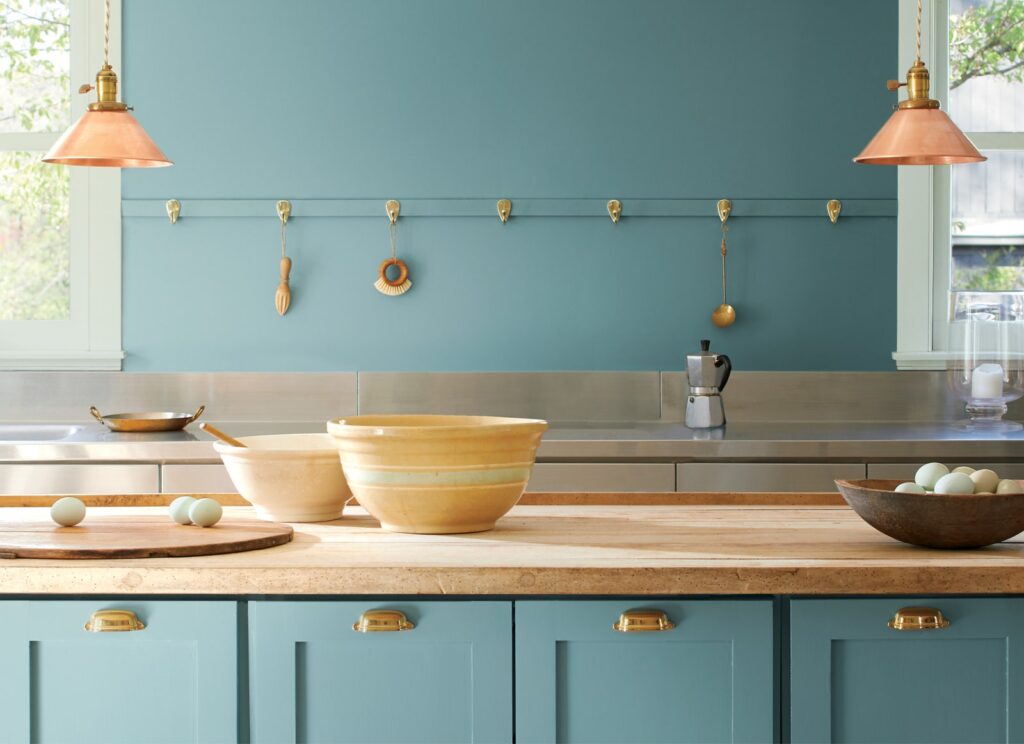
Aegean Teal by Benjamin Moore
Looking at water is a well-known stress reliever. So as we anxiously await widespread vaccine distribution from our homes, a proxy for the sea will do just fine. When Benjamin Moore announced Aegean Teal as its 2021 COTY in October, the company’s color marketing director Andrea Magno told AD PRO: “It has that soothing feeling that we’re looking for—it’s uplifting.” With more than a passing resemblance to verdigris, Aegean Teal doesn’t demand a maritime-themed facelift. Used with other hues from Benjamin Moore’s Color Trends 2021 palette—which also includes Amazon Soil, Atrium White, Beacon Hill Damask, Chestertown Buff, Foggy Morning, Gray Cashmere, Kingsport Gray, Muslin, Potters Clay, Rosy Peach, and Silhouette—the blue-green can star in a coastal milieu or underline a more polychromatic scheme.
Comfort Colors by PPG
Put a Caribbean spin on Aegean Teal and you might get Misty Aqua, a pale turquoise from PPG that the Pittsburgh-based company’s trend forecasters selected for 2021 as part of its first-ever COTY palette. The suite also includes oatmeal-colored Transcend and earthy Big Cypress. Together, the colors evoke the simpler, close-to-home activities of quarantine such as baking and hiking.
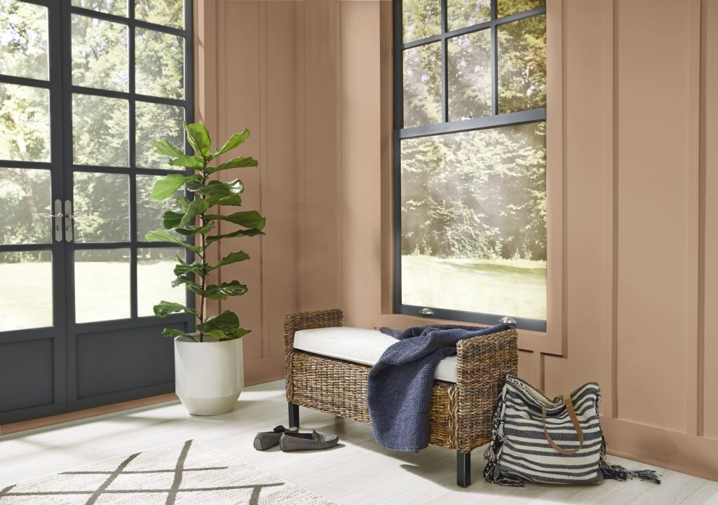
Urbane Bronze by Sherwin-Williams
The balm of nature also informed the Sherwin-Williams color marketing team in its September selection of Urbane Bronze for 2021. The ancient metallic color’s gravity, as well as its association with time-honored craft, contrasts the backlit screens that dominate home life more than ever. And what, you may ask, is Urbane Bronze’s standing in the Colormix Forecast for 2021, which Sherwin-Williams revealed to AD PRO this past August? It anchors the Sanctuary palette of warm natural tones. The 2021 selection also comprises Encounter, Continuum, and Tapestry palettes, with 40 colors in total.
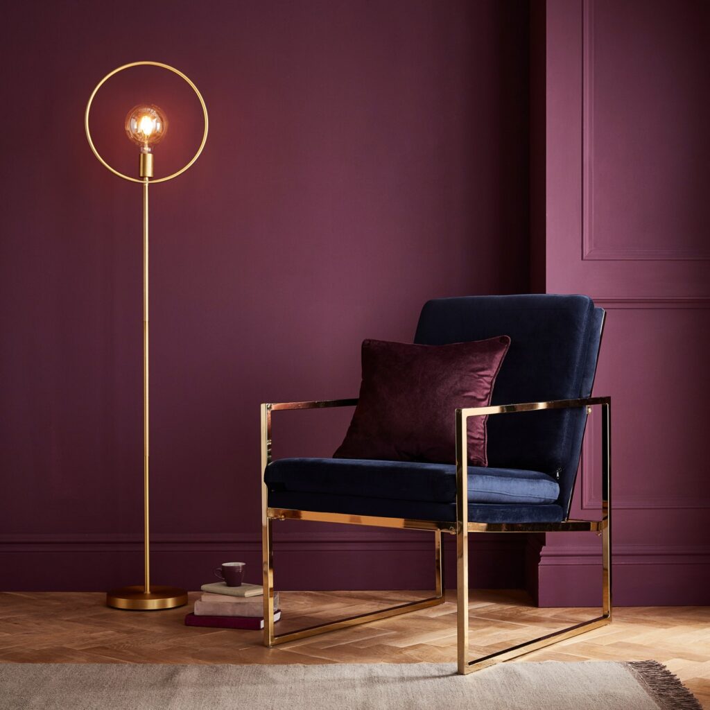
Epoch by Graham & Brown
In September, Graham & Brown’s color and trends specialist Paula Taylor told AD PRO that Epoch was “perfectly decadent yet cocooning.” A matte finish makes the plum color feel extra snuggly. Besides appealing to a hunker-down mentality, Epoch proposes a dramatic change for folks who have been staring at their homes’ neutral, eggshell-finish walls since March. Graham & Brown announced Epoch as the 2021 COTY alongside Timepiece as its wallpaper of the year.
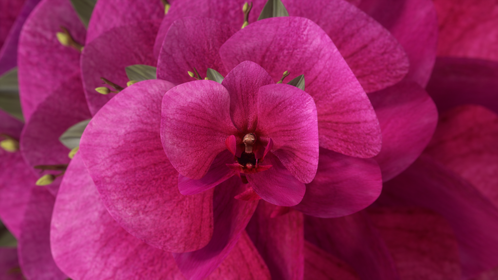
Orchid Flower from Coloro and WGSN
You can think of Orchid Flower as Graham & Brown’s Epoch, jolted awake: “This saturated magenta tone will be a great way to create a sense of positivity and escapism,” Coloro head of content Joanne Thomas said in a statement provided to AD PRO back in May. The vibrant, lush pink is the optimistic centerpiece of a spring-summer 2022 palette grounded by familiar Olive Oil, Butter, Mango Sorbet, and Atlantic Blue. Orchid Flower also is a source of consistency for the fall-winter 2022-2023 palette, where it stands out against the robust colors Honeycomb, Jade, Lazuli Blue, and Dark Oak. Both palettes are the work of Coloro in collaboration with global trend forecaster WGSN.
Color Trends Palette by Behr
There are shades of other forecasts within the 21-color array that makes up Behr’s 2021 Color Trends Palette. Voyage is Behr’s equivalent of Aegean Teal. Canyon Dusk is akin to Big Cypress. Euphoric Magenta and Epoch are notches on the same dial. When Erika Woelfel chatted with AD PRO in August, Behr’s vice president of color and creative services cited escapism, the outdoors, and timelessness as guiding influences, echoing the decision making of many of her peers.
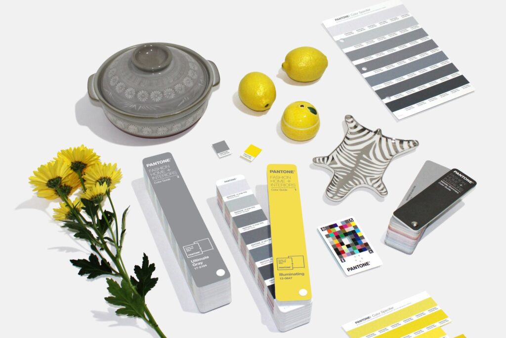
Ultimate Gray and Illuminating from Pantone
Last but certainly not least, earlier this month, Pantone announced its own hotly anticipated picks for 2021. Instead of settling on just one hue, the color authority named two tones to reflect both our difficult current moment and our hopeful future. Here’s hoping that 2021 will indeed be something like Pantone predicts: a ray of bright, cheerful yellow bursting out of a cool fog of gray.
Serving the Areas of Denver, Boulder, Highland Ranch, Lone Tree, Centennial, Littleton, Lakewood, Greenwood Village, Parker, Arvada, Golden, Westminster, Thornton, North Glen, Castle Rock, Longmont, Englewood, Aurora